Virgin Voyages has teased the world with their intriguing adults-only ships, creative events, and of course, unconventional names (sailors rather than passengers, for example). What they hadn’t shared however, was what the spaces on their ships might look like…until now. Let’s dive in to see not only what we can expect to see when they start sailing in 2020, but also, what those spaces mean for cru sailors, including an area that looks like it will excite guests while terrifying Virgin’s risk management team – and maybe cellphone insurers.
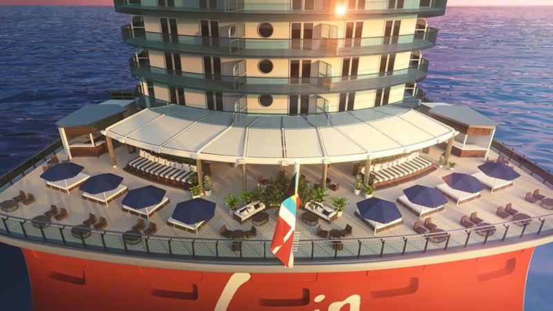
The design concept? “The Modern Romance of Sailing.” You’ve got our attention. Virgin has brought together a “Creative Collective” of some truly impressive design firms – not surprising at all. Tom Dixon’s Design Research Studio in London, Roman and Williams in New York, Concrete Amsterdam, Softroom in London and WorkAC in New York are creative minds behind Virgin’s first vessels, but interestingly, none of them have worked in the cruise industry until now.
“At the core of our Epic Sea Change For All is ensuring that the spaces on our ships are well-styled, distinct and reflective of the dynamic experience we want to bring to our sailors,” said Tom McAlpin, President and CEO for Virgin Voyages. “Our design partners together with our internal design team have dreamed up eye-catching, intimate and alluring spaces that we can’t wait to see come to life.”
While Modern Romance of Sailing is the guiding principle, each firm is working on areas onboard where they can highlight their strengths.
In a recent release, Virgin explained the concept like this:
“Within the brand ethos, modern is representative of a contemporary holiday aesthetic paired with romance, which offers a nod to a love of the historical glamour and sophistication of a sea voyage. Classic nautical elements such as steel, brass and portholes are tastefully sprinkled throughout the ship so that VirginVoyages sailors are always conscious that they are sailing at sea.”
“Ranging from gritty to glamorous, we’ve collaborated with a collection of brilliant interior designers and architects to create a variety of spaces that our sailors will love,” said Dee Cooper, Senior Vice President of Product Design for Virgin Voyages. “With careful thought, humor and attention to detail the Creative Collective has designed a ship that’s styled for those thirsty for a wonderfully modern holiday at sea.”
Richard's Rooftop - a Spot for VIPs
At the very top deck, Richard’s Rooftop designed by Tom Dixon’s Design Research Studio will be an outdoor lounge just for suite guests – something we’ve come to expect on modern ships. This private club will feature umbrellas and accents of dichroic glass, meant to compliment the design with shadows and reflections – a bold move on a ship which isn’t dependably facing the same direction at the same time at the same place on earth.
Pink Agave - Upscale Modern Mexican
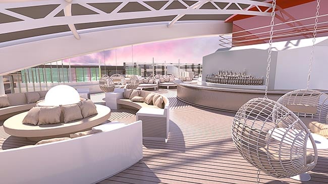
Virgin mentions that inside, Tom Dixon’s famed “void lighting” will be used at the entrance to Pink Agave, the ship’s upscale modern Mexican restaurant. While we personally don’t have any idea what “void lighting” is, it seems to be another case where lighting plays into the décor – and this trend continues. In Pink Agave, electric blue metallic light fixtures come from the ceiling highlighting oversized banquets along portholes in the venue. At the center is a long curved lounger surrounded by tables for two. There will also be a bar area and space for accommodating large groups.
The Manor - Virgin Voyages Signature Nightclub
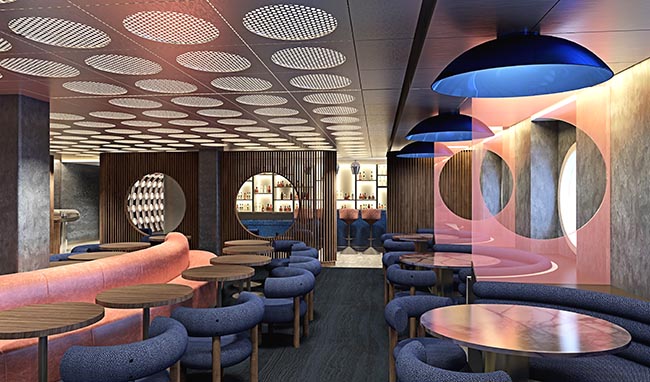
Roman and Williams design firm, famous for their work at The Standard Highline in NYC, have been charged with designing The Manor, Virgin Voyage’s signature nightclub inspired by Richard Branson’s history in the music industry and his first ever Virgin music studio (named The Manor, of course).
The Dock - a Relaxing Aft Lounge in Paradise
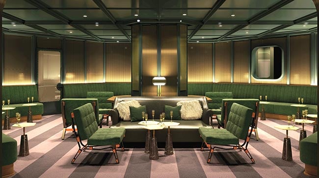
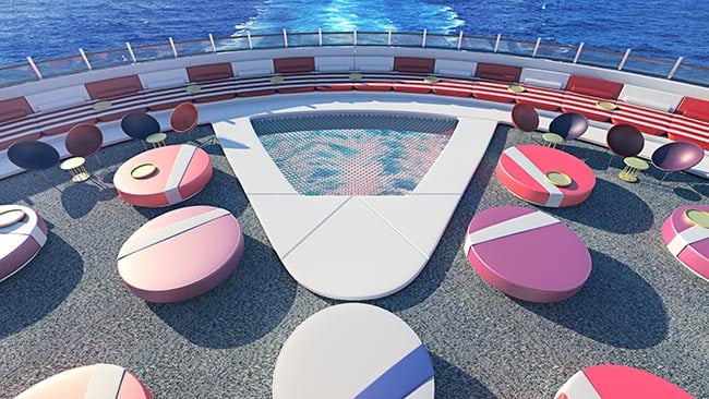
Roman and Williams are also designed The Dock, an outdoor aft lounge which takes advantage of the soothing view of the ship’s wake trail seen from above (deck 7, for those already planning their first day). The goal was to bring the feeling of the Hamptons, Ibiza, and Bali to the high seas – a space that was about the feeling that the view and atmosphere create, rather than a creation of atmosphere.
The Athletic Club - Not Very Sporty, But Great Views
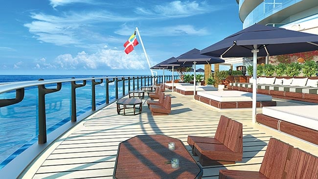
Despite the name sounding so sporty, The Athletic Club, at the top of the ship, features traditional nautical elements by Concrete Amsterdam along with, “the largest daybed at sea.” We can only wonder who will be left second in the famous "large daybed at sea" competition. Nearby is a 220 square foot area of netting where sailors can lay down and gaze at the open space and decks below, similar to the views offered in the middle of a catamaran…but much higher up. We’ll begin taking bets on how many phones are dropped through the nets while taking “the best selfie ever.” Spanning the beam of the ship, The Athletic Club also features 10 ocean-view cabanas with beverage service.
Test Kitchen - The Future is Here...in 10 Minutes, 15 at Higher Altitudes
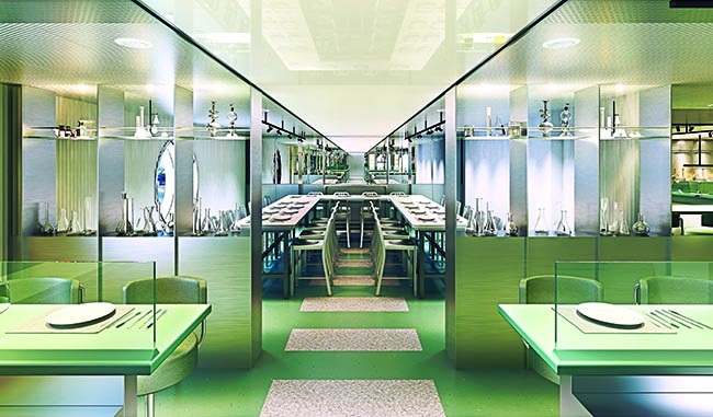
Known for some eccentricity in their designs, Concrete Amsterdam is behind hotels like CitizenM and hotel Zoku – admittedly different but neat and functional designs (we love the CitizenM at Schipol Airport in Amsterdam, and recommend it for an economical but great hotel). This team's, “human-centric“ approach aims to “nudge sailors” to focus on the form, function and elements of food at the Test Kitchen restaurant. At the entrance, this venue features lighting fixture images that mimic the periodic table. The Test Kitchen’s laboratory-like environment is accented by metallic furniture, clean lines and touches of beakers, test tubes and volumetric flasks.
Billy’s Take
While they’ve only offered us a small taste of what is to come, it seems to be in line with what we’d expect from the eccentric but practical brand Virgin Voyages has already painted in our minds. One thing we continue to look for are things that truly set them apart from the rest of the cruise industry. Yes, their terminology is a bit different as is the idea of an 18+ line, but it was very interesting to see right out the gate that there will be a suite only area – something incredibly popular on ships as of late, but very much “what the other guys are doing.” We’ll be watching to see if the Cabanas at the Athletic Club come with an up-charge as well, as these details can really show us how the brand is shaping beyond aesthetics and quirkiness. Also somewhat “following the pack” is the concept of having a signature nightclub across the fleet – though we get that every business needs easily tangible and marketable ways of maintaining brand consistency and customer expectations.
Overall the renderings look gorgeous and truly make us all the more excited for Virgin Voyages to start sailing in 2020. All of this in mind, we’re suckers for nautical theming and terms, so maybe we should find out your opinion. Oh, and the stern (The Dock area) - does that shape remind you a new ship from a certain Swiss cruise line?
What do you think? Do these renderings and tidbits about the first ships make you more or less interested in trying them out? Comment below or reach out on Facebook or Twitter.

